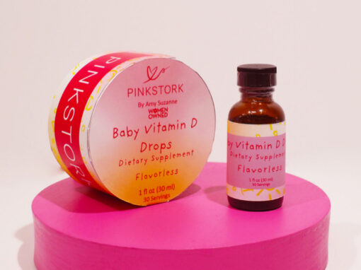
Pink Stork Package Design
The Goals of this project are to redesign the
infant’s vitamin drops for the “PINKSTORK” company.
They desired for us to take their current layout
and help move their design elements into a more
kid friendly brand image, with the goal of helping
to separate itself from the standard branding of
their women’s wellness products. They wished for
something that felt fun and a bit more illustrative,
mimicking some of their other marketing elements.
In an attempt to fit this criteria, I will use more
pastel versions of their default color schemes,
including their trademark pink alongside a unique
color for each different product. Ill also use illustrative
elements to break up the empty space surrounding the
box in order to make it appear more fun and childlike

Final logo design
I designed my product designs to effectively stand out
amongst PinkStork’s other products. The combination of
simple, scattered illustrations along the sides of the box as
well as the pastel, softer versions of their brand colors help
to fluidly convey the child centered nature of the product. it
comes off as a less intense version of their other products,
implying it’s safe for a child to handle without sacrificing the
quality already established with the brand.


I designed the box as a cylindrical shape that separates
into a top and bottom half. The rounder shapes and lack of
corners give the packaging a sort of nest feeling, helping
to reinforce both the pink stork imagery as well as tying it
back to the infancy centered product line. Not only did I feel
this would help to draw consumers to the unique packaging
shape, but arranged properly, the cylindrical shape would
help to better protect the glass bottles, reducing the risk of
damage before and after purchase.